Difference between revisions of "Distraction"
| Line 2: | Line 2: | ||
|headline=Distraction | |headline=Distraction | ||
|coordhead=18.000, 264.121, 0.000 | |coordhead=18.000, 264.121, 0.000 | ||
| − | |image1= | + | |image1=/wiki/images/Distraction.png |
|coordimg1=0, 0, 0 | |coordimg1=0, 0, 0 | ||
|simploduction=<ul> | |simploduction=<ul> | ||
Revision as of 07:54, 7 May 2021
| headline | Distraction |
|---|---|
| headline coordinates | 18.000, 264.121, 0.000 |
| image | /wiki/images/Distraction.png |
| image coordinates | 0, 0, 0 |
| simple introduction |
|
| simple introduction coordinates | 0, 0, 0 |
| testimonial | "Trevor" is a bright 18-year-old who plays games and watches music videos on his laptop. He lives at home with his parents and younger sister. He attends a special school where the teachers and staff can help with his social and communication challenges from his Autism Spectrum Disorder, while he works to pass his high-school exams.
He has problems with visual information and recognizing things on the page. His reading skills are not helped by his trouble concentrating on the page or screen long enough to read. His teachers showed him how to make the text bigger on the page. They told him how to use a printable view to hide all the ads with moving images that distract him, because he reads every word on the page very carefully and literally. He can be easily confused by colloquialisms and metaphors. He can also be overwhelmed by sites that offer too many choices. <a href="https://w3c.github.io/wcag/coga/user-research.html#some-personas-with-use-cases-that-address-key-challenges-1">Source</a> |
| testimonial coordinates | 0, 0, 0 |
| links to | |
| belongs to | Sensitivity, Attention |
| contains | Distraction_References |
simple introduction
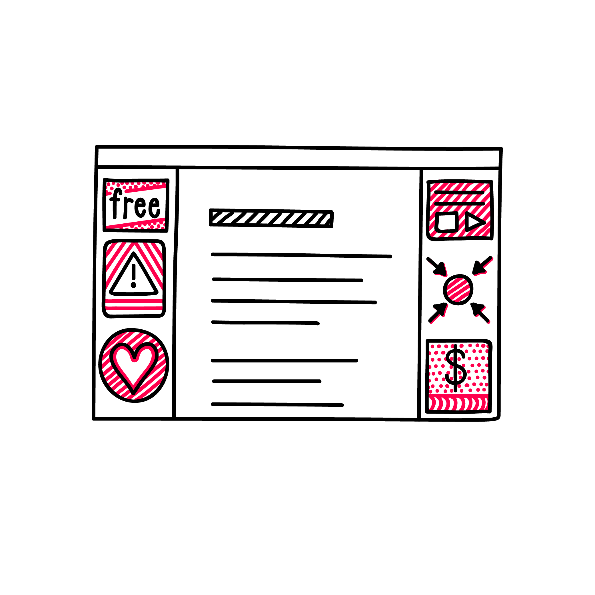
- This part is about how to keep a user's attention on the content.
- The presence of certain design elements, media or unrelated contents can be distracting.
- By adapting certain features, such as media, typography and layout, it is possible to increase the attention span.
- Providing a distraction-free environment can make it easier to take in contents.
testimonial
"Trevor" is a bright 18-year-old who plays games and watches music videos on his laptop. He lives at home with his parents and younger sister. He attends a special school where the teachers and staff can help with his social and communication challenges from his Autism Spectrum Disorder, while he works to pass his high-school exams. He has problems with visual information and recognizing things on the page. His reading skills are not helped by his trouble concentrating on the page or screen long enough to read. His teachers showed him how to make the text bigger on the page. They told him how to use a printable view to hide all the ads with moving images that distract him, because he reads every word on the page very carefully and literally. He can be easily confused by colloquialisms and metaphors. He can also be overwhelmed by sites that offer too many choices.
