Difference between revisions of "Contrast"
Jump to navigation
Jump to search
| (14 intermediate revisions by the same user not shown) | |||
| Line 1: | Line 1: | ||
{{Website | {{Website | ||
|headline=Contrast | |headline=Contrast | ||
| − | |coordhead= | + | |coordhead=333.000, 12.445, 0.000 |
| − | |image1= | + | |image1=/wiki/images/Contrast.png |
|coordimg1=0, 0, 0 | |coordimg1=0, 0, 0 | ||
|simploduction=<ul> | |simploduction=<ul> | ||
| − | <li> | + | <li>How to ensure sufficient contrast in the visual presentation of content.</li> |
| − | <li> | + | <li>High contrast is important to ensure the perception of content.</li> |
| − | <li> | + | <li>Some color combinations produce a higher contrast than others.</li> |
| − | <li>Visual content with low contrast may not be | + | <li>Visual content with low contrast may not be recognized by people with limited vision as well as in certain situations, such as in strong sunlight or with low screen brightness.</li></ul> |
|coordsimplo=0, 0, 0 | |coordsimplo=0, 0, 0 | ||
| − | |testimonial= | + | |testimonial=There is no user story for this topic.<br><b>You can contribute a story.</b> <br>Use the private survey or the public forum to do so. <br> <a href="https://lehmannmax.de/Survey/survey.html" class="contribute">Go to the survey</a> <p id="testi_fill">-</p> <a href="https://lehmannmax.de/wiki/index.php?title=Special:WikiForum/Share_your_user_story." class="contribute"> Go to the forum</a> |
|coordtesti=0, 0, 0 | |coordtesti=0, 0, 0 | ||
|linksto=color | |linksto=color | ||
| − | |belongsto= | + | |belongsto=Sight |
|contains=Contrast_References | |contains=Contrast_References | ||
}} | }} | ||
| − | |||
| − | |||
| − | |||
| − | |||
| − | |||
| − | + | __TOC__ | |
| − | |||
| − | ==[[Contrast_References| | + | [[File:Contrast.png|400px|none|Illustration Contrast]] |
| + | <div class="text_content"> | ||
| + | ==Overview== | ||
| + | * How to ensure sufficient contrast in the visual presentation of content. | ||
| + | * High contrast is important to ensure the perception of content. | ||
| + | * Some color combinations produce a higher contrast than others. | ||
| + | * Visual content with low contrast may not be recognized by people with limited vision as well as in certain situations, such as in strong sunlight or low screen brightness. | ||
| + | |||
| + | ==User story== | ||
| + | There is no user story for this topic. | ||
| + | |||
| + | '''You can contribute a story.''' | ||
| + | |||
| + | Use the private survey or the public forum to do so. | ||
| + | |||
| + | [https://lehmannmax.de/Survey/survey.html Go to the survey] - [https://lehmannmax.de/wiki/index.php?title=Special:WikiForum/Share_your_user_story. Go to the forum] | ||
| + | |||
| + | ==[[Contrast_References|References for Contrast]]== | ||
===[[Contrast_References#General|General]]=== | ===[[Contrast_References#General|General]]=== | ||
| + | </div> | ||
Latest revision as of 17:07, 12 June 2021
| headline | Contrast |
|---|---|
| headline coordinates | 333.000, 12.445, 0.000 |
| image | /wiki/images/Contrast.png |
| image coordinates | 0, 0, 0 |
| simple introduction |
|
| simple introduction coordinates | 0, 0, 0 |
| testimonial | There is no user story for this topic. You can contribute a story. Use the private survey or the public forum to do so. <a href="https://lehmannmax.de/Survey/survey.html" class="contribute">Go to the survey</a> - <a href="https://lehmannmax.de/wiki/index.php?title=Special:WikiForum/Share_your_user_story." class="contribute"> Go to the forum</a> |
| testimonial coordinates | 0, 0, 0 |
| links to | color |
| belongs to | Sight |
| contains | Contrast_References |

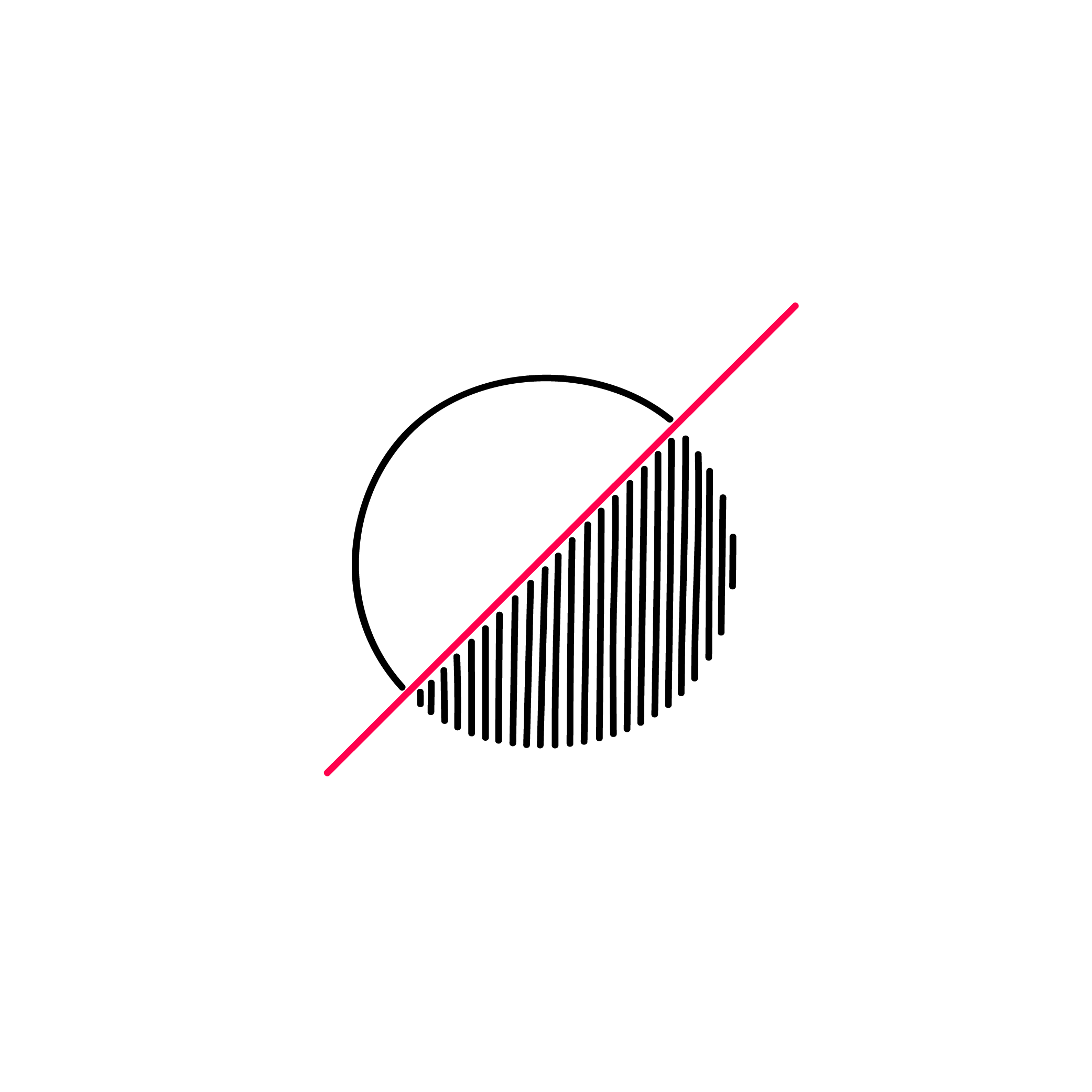
Overview[edit]
- How to ensure sufficient contrast in the visual presentation of content.
- High contrast is important to ensure the perception of content.
- Some color combinations produce a higher contrast than others.
- Visual content with low contrast may not be recognized by people with limited vision as well as in certain situations, such as in strong sunlight or low screen brightness.
User story[edit]
There is no user story for this topic.
You can contribute a story.
Use the private survey or the public forum to do so.
Go to the survey - Go to the forum